project brief
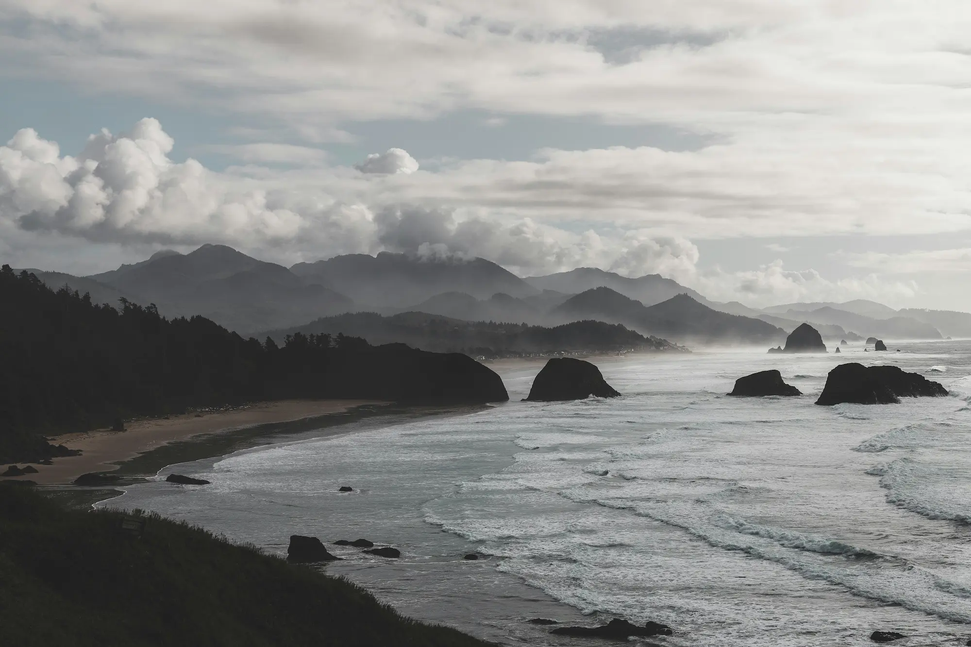
Park visitations in BC increased by 23% between 2015 and 2019. During the pandemic, campsite reservations reached a record high.
With limited inventory and an increased demand for outdoor recreation, local residents began expressing frustration over their inability to reserve campsites. How can the reservation system be improved to accomodate for an increasing demand?
Role
UX Research
UX/UI Design
Highlights
Design System
Accessibility
Information Architecture
Tools
Figma
Useberry
Optimize Workshop
Overflow.io
Duration
3 months
discover + define
Framing the Challenge
Keeping an open mind was key to getting a better understanding of the problem and its users. An explosion of questions, assumptions, researching and thinking were involved to understand the context, and insights were distilled to sharpen the focus of this project.
Methods Used
User interviews
Usability testing
Affinity mapping
Journey map
The Five Whys
Design strategy
user research
5 candidates with varying interest in outdoor recreation and experience levels were selected to conduct user interviews with. A think-aloud usability testing segment was also included at the end of each session to evaluate the reservation system.

Being a reservation system user myself, I was very cautious of my own assumptions at this stage. To avoid confirmation bias, I wrote down a list of assumptions I had and made sure that they were not reflected in my interview questions. Questions were kept as open-ended as possible.
artifact
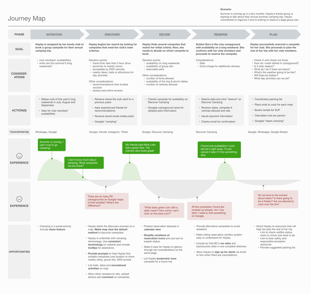
Journey Map
A journey map proved to be a useful tool for processing my findings and building empathy for the users while uncovering design opportunities. It was at this stage that I realized a lot of information users wanted to know were actually available on BC Park's main website, unaware and underutilized.
research findings
There is a mismatch of mental models between what is currently offered (a utility tool for reserving campsites) versus what users expect to accomplish (a place to discover recreational activities).
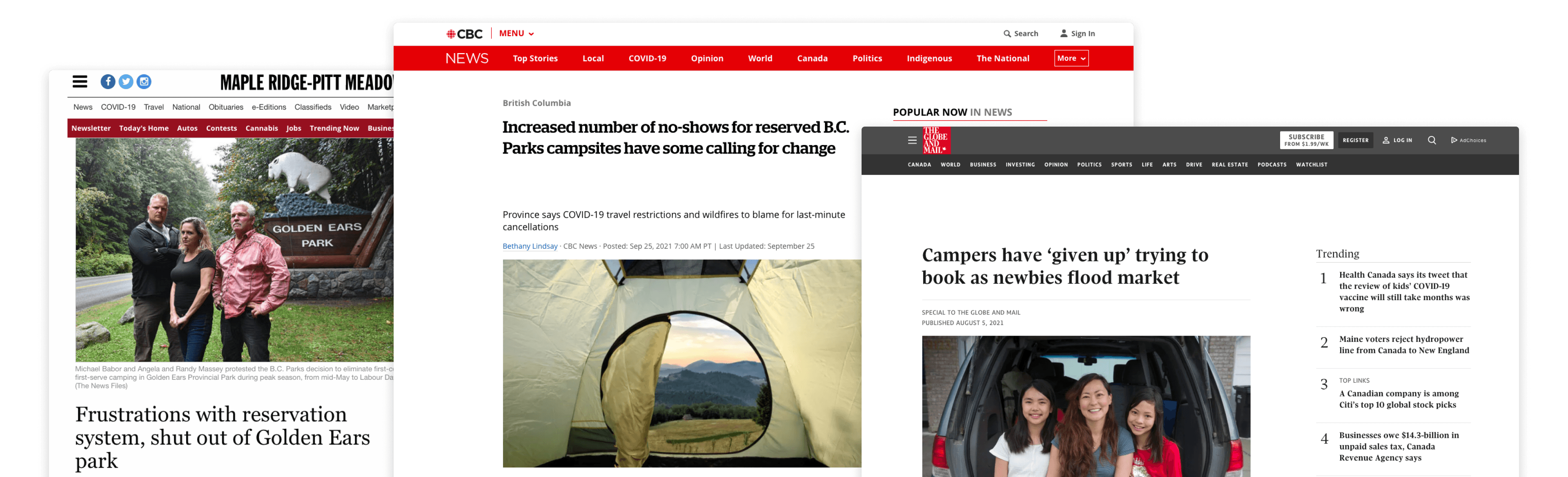
All users turned to Google Maps and Google search to discover places, however, another problem surfaced →
A variety of terms were used to refer to eg. campsite by both experienced and inexperienced users. Granted, this seems to be an industry-specific issue – a quick search on Google using camping, campground, campsite and rec site all yielded different results.
As an authoritative source of information, there was an opportunity to inform, clarify and educate.
With limited availabilities during peak seasons, reserving campsites was a highly competitive activity. As reservations could be made up to 2 months in advance and rolled out daily at 7AM, people woke up early/ stayed up to secure their desired campsite, only to lose out to many who were also doing the same. This was repeated daily until a reservation was made, or until they gave up.
People also returned to the system throughout the day in hopes of finding last minute cancellations. If they could secure a reservation, they also had to drastically change their work schedule at short notice in order to go camping, which was an inconvenience and was undesired.
The root cause
The Cycle of Snatch First, Cancel Later
A host of pain points were uncovered, but the bigger picture remained to be seen. Norman Nielson’s Five Whys method was what I needed to help me step back and understand what was going on.
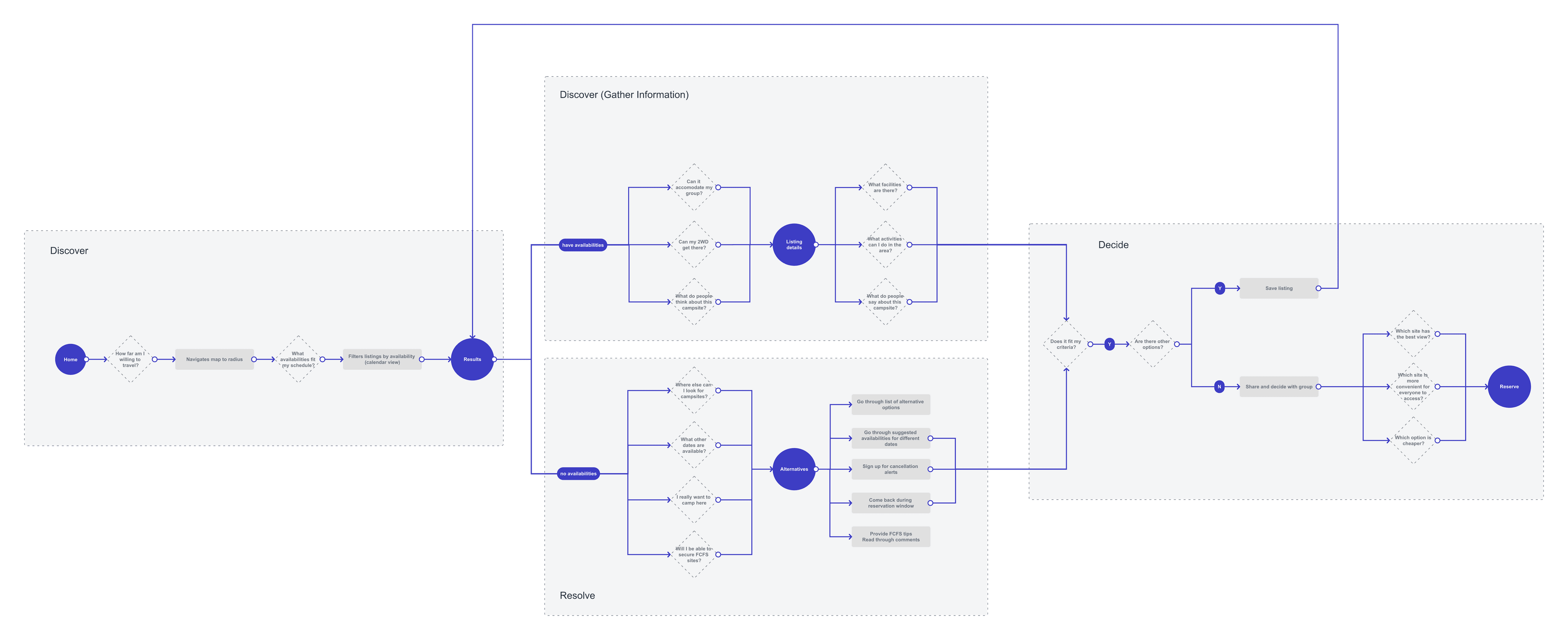
Snatch first, cancel later – a mentality all users have developed as a result of learned experiences with the reservation system. The majority of user behaviours observed seemed to be fueled by the inability to discover camping options, which led to high demand for well-known locations, contributing to campsite shortages and a "snatch first, cancel later" mentality.
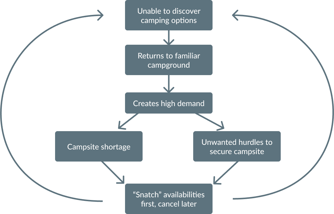
It seems that improving the ability to explore may be key to resolving the system's bottleneck issues.
define
Design Strategy
To break the cycle of "snatch first, cancel later", placing discovery at the forefront became my top priority. The design should also bridge the gap between user needs, BC Park’s mission as well as meeting technical and financial constraints.
With these in mind, I laid out my design strategy together with some principles as guidance:
Support Planning Process
Encourage Exploration
Support visual exploration by bringing maps to the forefront
Natural Flow of Information
Unify information between the Park Board and reservation system website
Support informed decision-making by providing key information as needed
Simplify Interface
Reduce cognitive friction by making use of affordances in tools users are already familiar with
Resolve Deadends
Provides Options and Alternatives
Improve visibility of alternative recreational options
Providing alternative paths to any possible dead ends
Project Constraints
Low Maintenance
Solution must have a low requirement for long-term maintenance
Providing alternative paths to any possible dead ends
Future Proof
Solution must be able to accomodate for growing inventory and increased traffic
Accessibility
Solution must be easily accessible by users of a wide demographic and backgrounds.
ideation
Exploring Solutions
Process
User flow
Card sorting
Wireframing
Prototyping
Usability testing & reiterations
user flow
Discovery at the Forefront
To reframe the reservation system as a platform for discovery, the user flow was overhauled. Referencing my journey map, I crafted a new user flow that begins the trip planning journey with open-ended exploration, guiding the users through their decision-making process until reservation.
Alternative paths were also provided should availabilities become limited.
information architecture
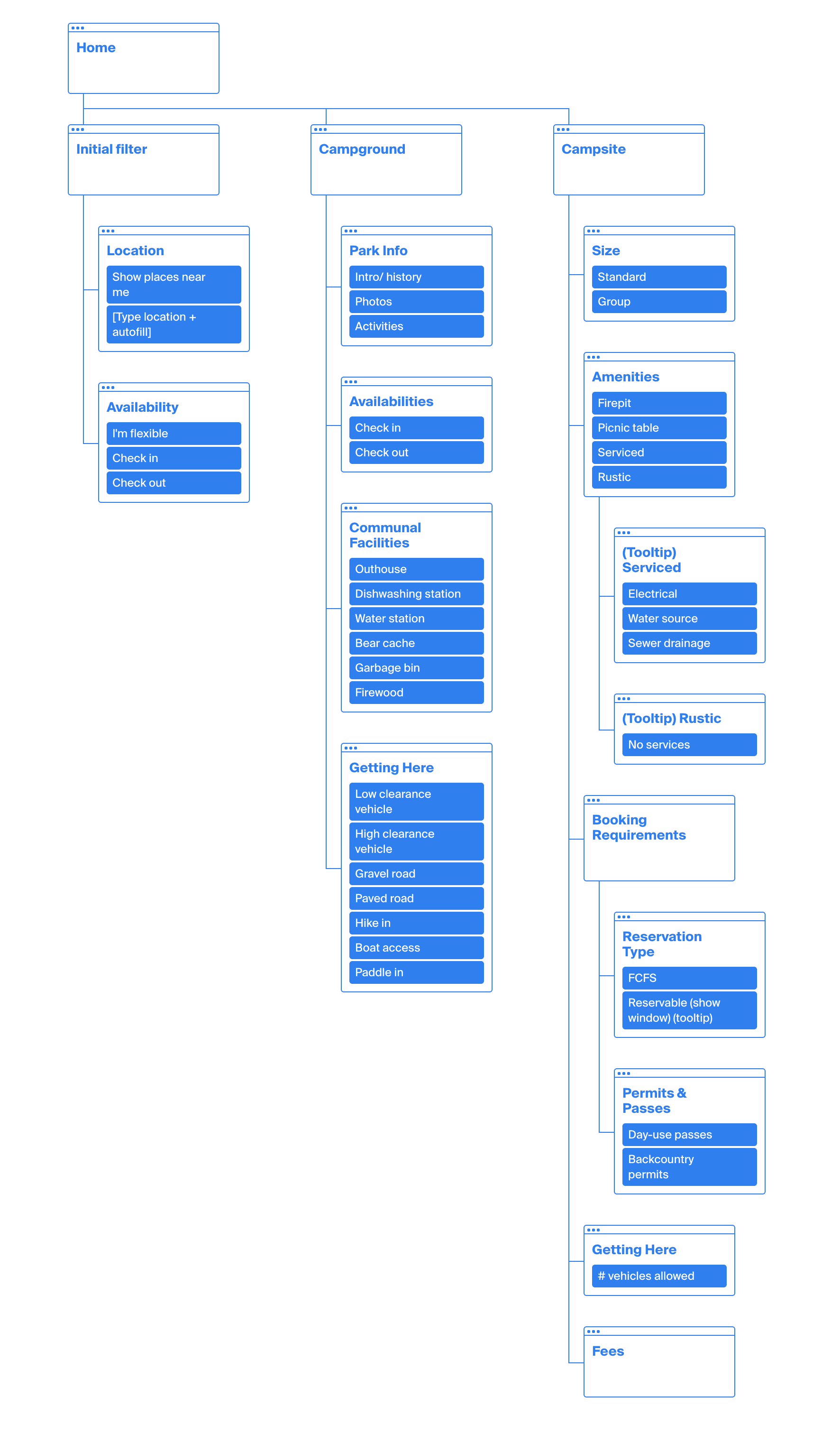
Aligning Mental Models
To address issues with mismatched mental models, I audited the existing information architecture on BC Parks' website together with terminologies used during the interviews. I then carried out an open, unmoderated card sort activity. The result was a new information structure with groupings and terminologies that reflected the way users think, reducing cognitive friction and supporting users with decision-making.
wireframe & prototype
Visualizing the Approach
Without reinventing the wheel, I brainstormed ideas on pen and paper, leveraging design patterns and affordances from tools that users were familiar with, such as Google Maps and Google search, as well as booking experiences from Airbnb, Expedia and reservation systems from other provinces and states. I also kept in mind the Gestalt Principles to guide my designs as I continue to work on reducing cognitive load.
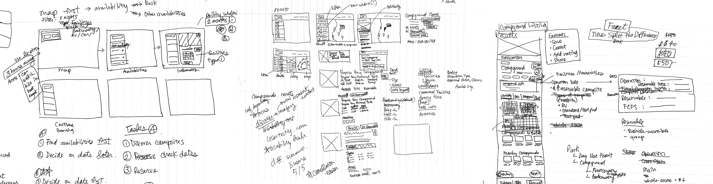
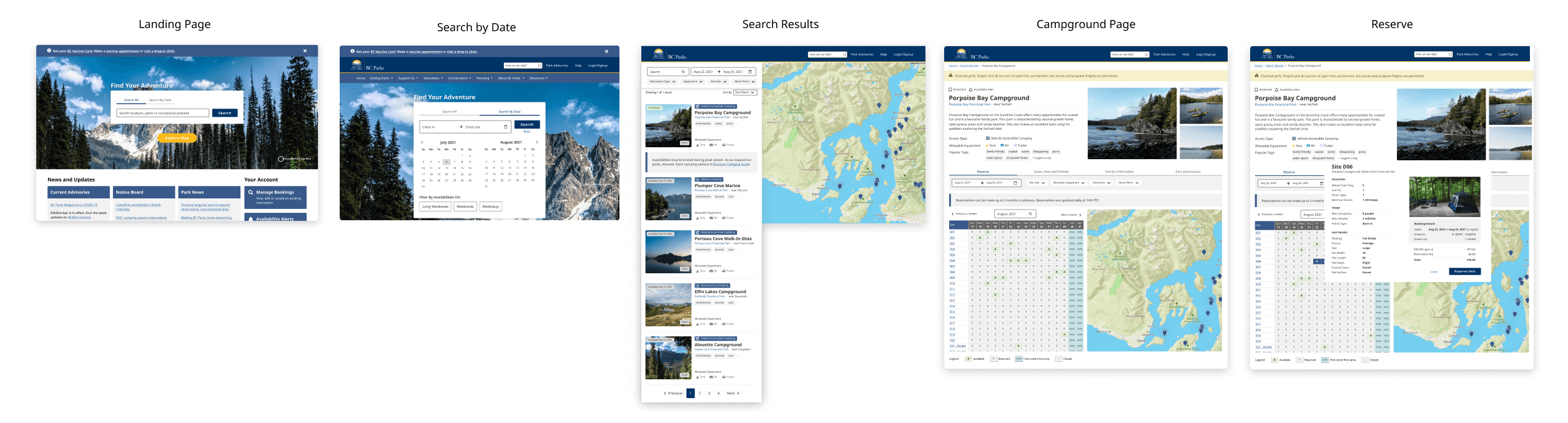
Key elements set out in my design strategy were implemented, and a prototype of the primary user flow was swiftly created thanks to BC's existing design system, Dev Hub, ready for testing.
round 1 testing
Validating the Approach
I conducted a round of moderated usability testing via Zoom with both casual and experienced users to gather some qualitative feedback on this approach. Using the same parameters as my journey map, I provided the same scenario and assigned testers the same task – summer is coming up, they want to reserve a campsite to go camping with their friends.
😮
I did not know you could camp at the Chief!
🤔
I think I have enough information to make a reservation? I don't camp a lot, so I don't really know what to look for.
🤔
Can my car get there?
🤔
It's like booking a hotel on Expedia!
Test Results
Overall, this round of testing validated the discovery-first approach, as both experienced and inexperienced users instinctually began their task with an open-ended search, discovered activities with the map and navigated to the "Reserve" button without much friction.
Some insightful feedback were also given to the key elements set out in the design strategy:
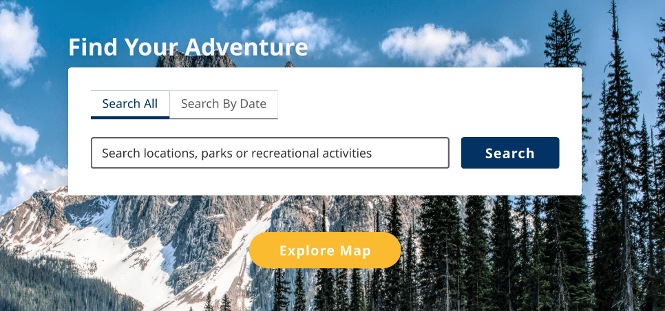
Open-ended search
All testers began the task by instinctually clicking the "Search" button to jump to the next step, instead of the "Explore Map" button that was introduced below. Open-ended search was the right direction, but usability needed to be improved.
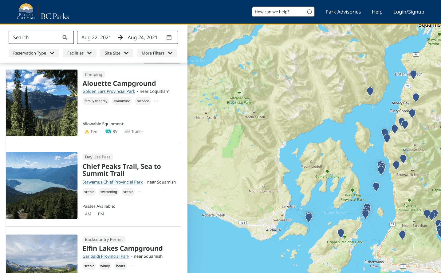
Visual exploration
All testers instinctually interacted with the larger map and successfully discovered new activities that they were not previously aware of, validating the effectiveness of this visual discovery approach in dispersing interest.
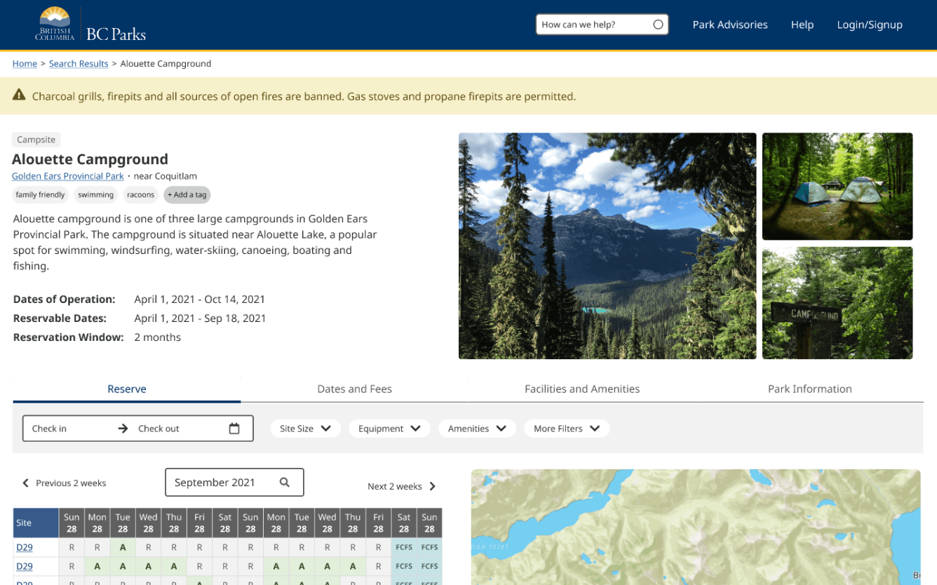
Information Hub
Each campground was treated as a centralized information hub. Based on the user flow, key information were given most visibility, and supplementary information were grouped in tabbed menus below for easy access.
Testers retrieved the majority of information they needed at each stage without much friction and navigated through the task relatively quickly.
However, now that testers were more informed, they also asked new questions and required clarification for more terminologies, which needed to be addressed in my iterations.
round 2 testing
Finetuning the Experience
I reiterated the prototype with the insights and then applied the reiterated prototype to secondary user flows and use cases. For my second round of testing, I went with unmoderated usability test on Useberry to track clicks, collect heatmap data and completion time metrics to assess the effectiveness of the use cases.
